

Use the overview
Your results at a glance: the headline figures, how candidates did, where the marks were lost, and what is waiting on you.
Updated
Team workspaces are opened on request. Ask for one; this is how it works once yours is open.
The headline figures
Overview opens on four figures, for the Period chosen above them — 30 days, 90 days, 12 months or all time — and, when more than one assessment has been sent, the Assessment. Every figure counts the invitations sent in that period, and the choice stays in the address, so you can share the view.
- Invited
- Invitations sent, and how many are still open.
- Completion
- Completed, out of the invitations that have closed — completed or expired.
- Pass rate
- Passed, out of completed.
- Median score
- The middle score, with the middle half of the scores beside it.
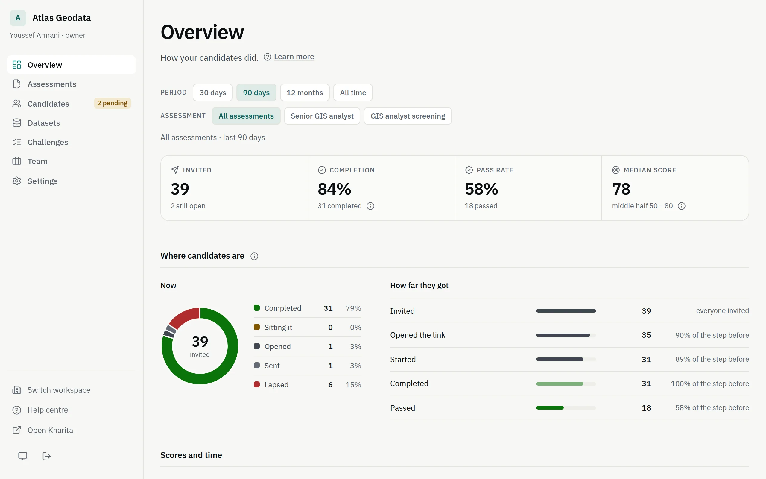
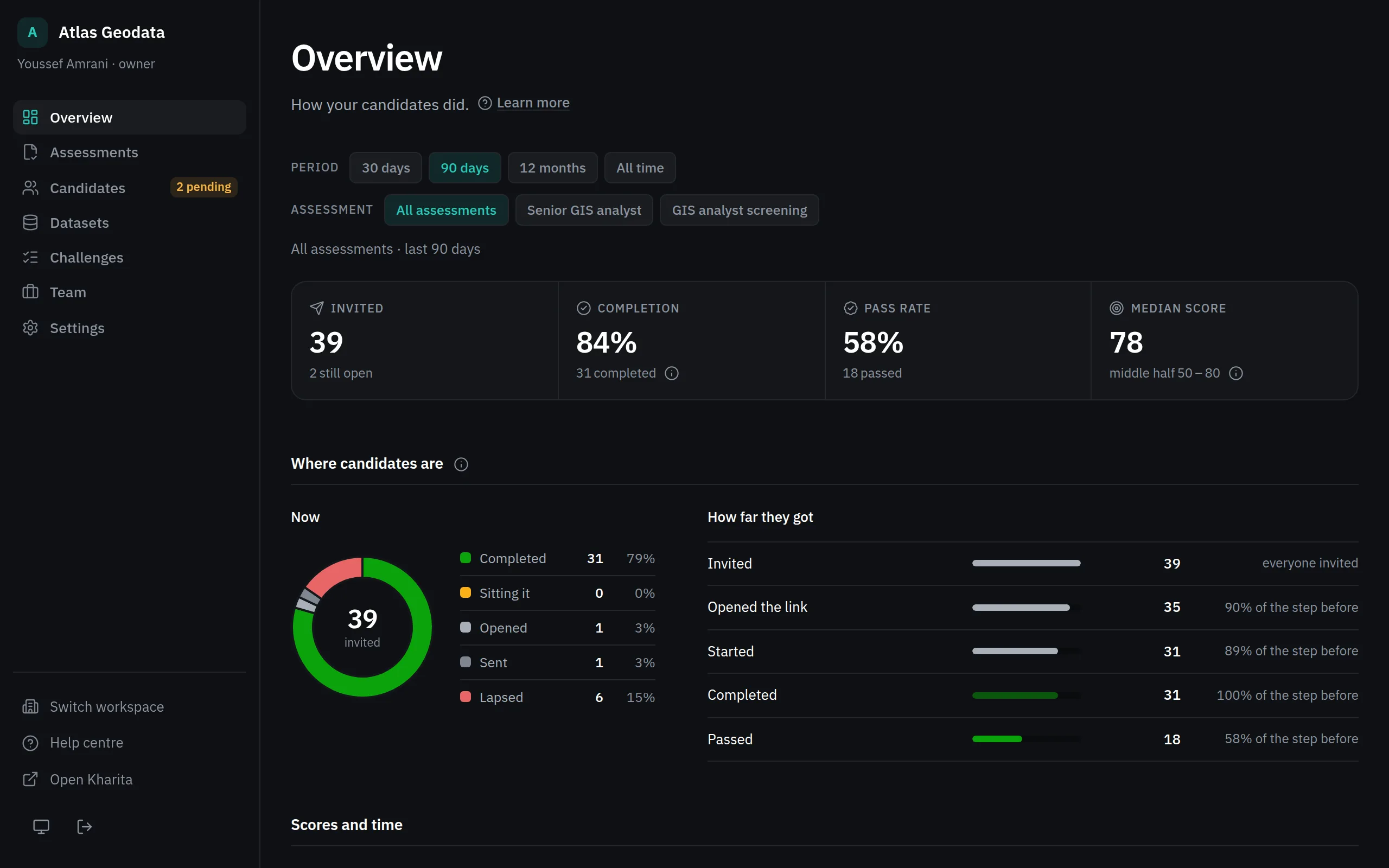
The arrows compare with the period of the same length before: in points for the rates, and same when nothing changed.
The charts
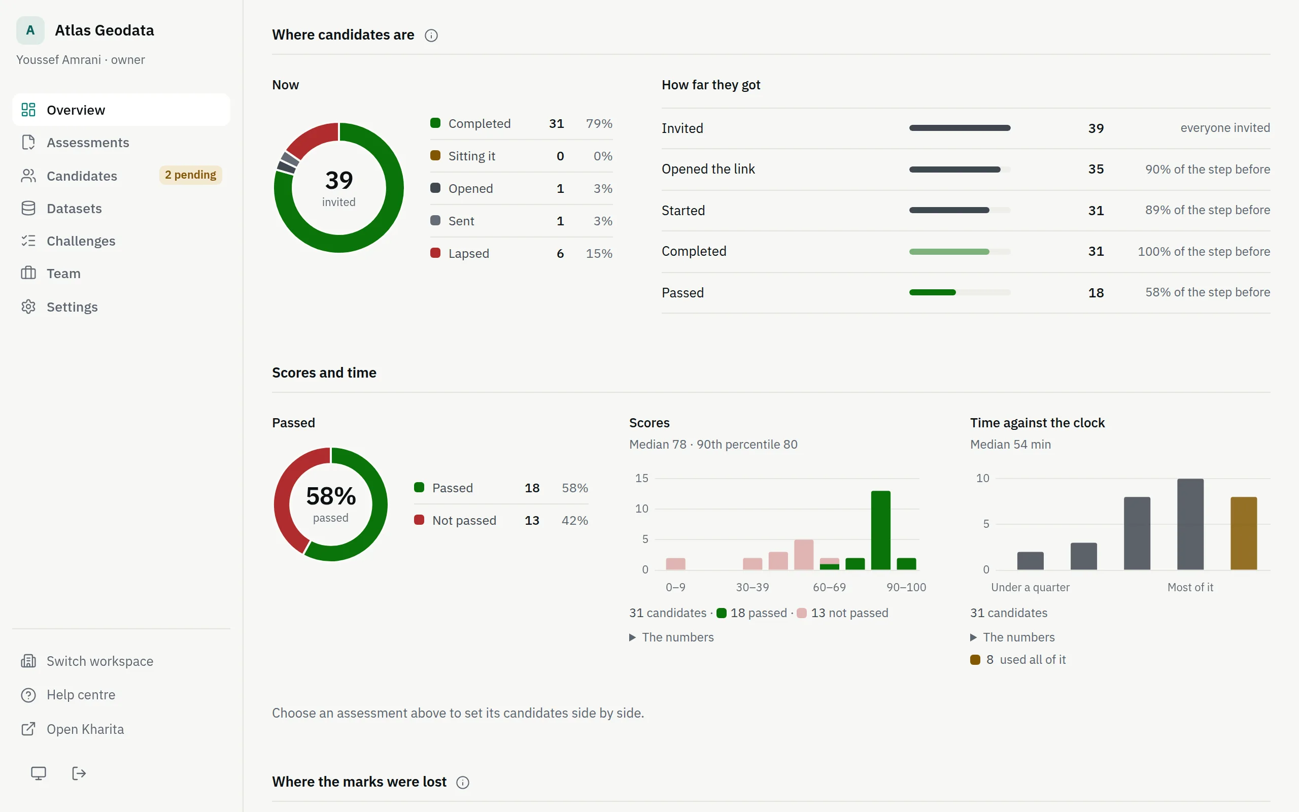
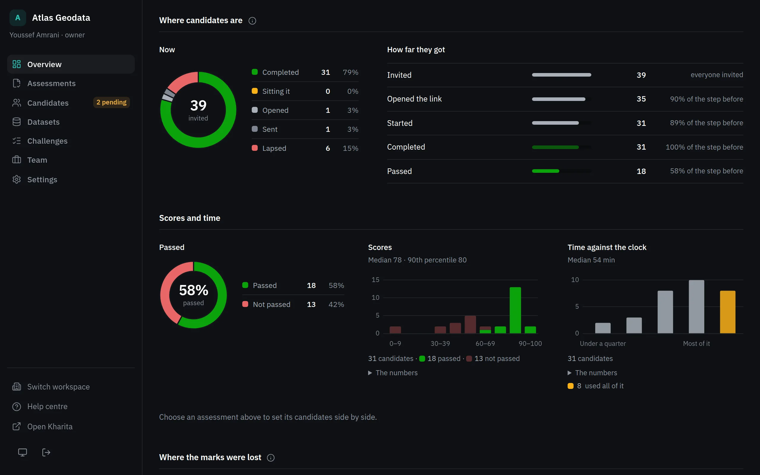
- Where candidates are: a donut of where everyone invited is now, and the steps from invited to passed, each as a share of the step before.
- Scores and time: passed against not, scores in bands of ten, and how much of the clock people used.
- Candidates side by side: with one assessment chosen, the top ten, each section's score coloured against the pass mark.
- Where the marks were lost: by section or track, the requirements missed most, and each problem's average.
- Invitations each week, and with several assessments, Assessments side by side.
What is waiting on you
Under the figures and charts come three lists: Latest results, Invitations about to lapse — not started and expiring within three days, worth a reminder — and, for owners and admins, assessments Ready to activate.
Related
Still stuck? Write to Support